All About Mattes

It’s true that I have a deep, unending love affair with eyeshadow palettes. And with my collection consisting of both affordable products, as well as super high end luxury… and everything in between, well I think it’s safe to say that I have zeroed in on what I like. And what I don’t. And honestly, what I like for a specific price point. Because really, I don’t have the same requirements for a palette that costs $15 as I do for a palette that costs $130. So let’s explore that a little bit. What do I think truly separates the high end from the affordable? For the most part… it’s the mattes.

I know a lot of people don’t place a ton of importance on Mattes. And sure, if you aren’t going to blend your shadows, then they aren’t important in your eyes. But if you do want that blend, quality Mattes are what you need. I think Brushes make a difference too, but for right now, I’m going to stay on the topic of shadows themselves.

When I first started getting into makeup, I didn’t really notice much of a difference from one brand to the next. Unless a palette was downright terrible, but that’s sort of rare to come across. But as my collection grew, I did start to notice subtle differences, that actually made a really big difference on my end result. Or, the time required to achieve the look I was going for.

There is one word you will hear over and over in the beauty community… and I think that word is misleading. What’s the word? “Pigmented”. While pigment level is no doubt important, it’s not the end all and be all of what makes an eyeshadow great. For me, the way they blend and build is far superior in most cases. When you have a shadow that was made to be the most pigmented, what you are left with is a shadow that is actually really hard to work with. You may be blending for a lot more time than you wanted to commit to doing your makeup. And you may see a patchy application that you can’t really fix. A good example of this is the Anastasia of Beverly Hills “Subculture” palette. I know… a lot of you like it anyway… but it is undoubtedly harder to work with than some other palettes. I have achieved nice looks with that palette as well, so it’s not impossible… but for me… in the end… I decluttered that palette. I have many more palettes that are easier to work with, so why hold on to one that gives me issues?

If you follow me on Instagram, then you may know that some of my favorite brands are Viseart and Natasha Denona. The funny thing about that is the fact that they both have very different formulas from eachother. But I love them both, probably equally actually. And I own [almost] the complete collection of both.

So what makes them stand out to me? Well for Viseart it’s 100% the way they apply and blend. The shadows (Mattes) are more dry in texture than you would expect. But they apply and blend like a dream. I can build them up to my liking, and they are just so easy to work with.

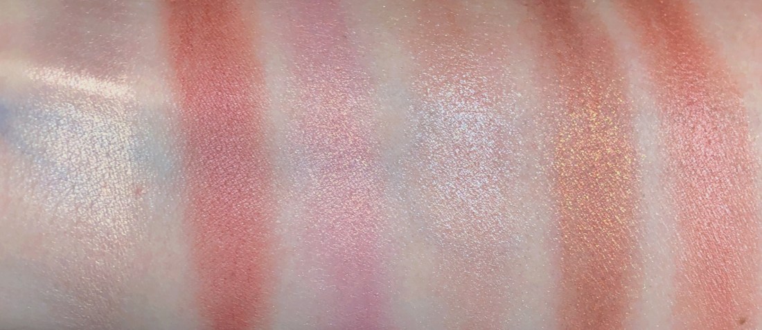
Viseart Apricotine Petit Pro

Natasha’s Mattes feel almost creamy. And I also enjoy how hers blend. But I will say that some shades benefit from a different technique… more of a packing motion then blending afterwards.

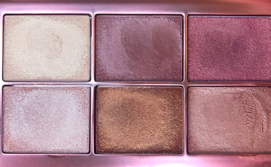
Natasha Denona Sunset Palette

But there are obviously other brands that I enjoy as well. I can tell you that probably the biggest surprise hit for me, was the Dominique Cosmetics Latte Palette. This brand was created by a YouTube that I don’t watch. I’m not a fan. I don’t dislike her (well I do dislike the level that she photoshops her images… therefore making young girls aspire to something they will never be able to achieve… but that’s a different story), I’d say I’m just indifferent on her. Neither a fan nor a hater. But her Latte Palette… truly extraordinary Mattes in that bad boy. Honestly right up there with my much more expensive faves. Every time I have created a look using the Latte, I have been impressed with the flawless blend and the speed in which I was able to do my makeup. I was also shocked that such quality shadows could be found at the $45 price point. Do I think the Latte Palette is better than ABH? UD? Too Faced? And all the other mid range brands? Absolutely I do. Unfortunately, so far, only this initial release. Her subsequent palettes I’m not as impressed with. Her Lemonade Palette was an absolute abomination. And her Berries & Cream Palette I feel lukewarm about. I will try her new release, the Rustic… in a few days. But so far, only the Latte Palette is a standout hit in my book.

Dominique Cosmetics Latte Palette

So where does that leave ColourPop? Well, I do like ColourPop. But I really wouldn’t put them in the same quality category as all of the above brands. I can definitely get a great look out of them. If I couldn’t, I wouldn’t continue to buy them. But it does take more time for me to get there. I do think though, that at $12-24 per palette, ColourPop is the best brand at such an affordable price. And I think they set the bar for other brands in that price range.

ColourPop Brown Sugar Palette

I have a few other “hits” that I look at as exceptional palettes as well. And one of those is actually made by ColourPop… the KKWxMario palette. Even though it is made by ColourPop, I found the shadows to be a bit more luxe than ColourPop. I haven’t bought any of her other palettes, but really only because nothing else has drawn me in. I definitely like the quality enough to make another purchase. I’m just waiting for a color story that appeals to me.

KKWxMario Palette

So that brings me to other popular brands. Here are my thoughts on their shadow palettes summed up:

  • TOO FACED: Haven’t felt they were anything special in a long time.
  • URBAN DECAY: some hits, some misses. LOVE the Naked Cherry palette.
  • ANASTASIA of BEVERLY HILLS: Seriously not my favorite. I don’t love their shadows at all. I’ve gotten some great looks from some of their palettes, but I really have no burning desire to keep purchasing their palettes.
  • MARC JACOBS: another one with hits and misses. I LOVE the steeletto palette.
  • LIMECRIME: usually worth it when I like the color story. Love the Venus XL2 and the Venus 3.
  • DIOR: okay. Nothing special. Their lip products are awesome though.
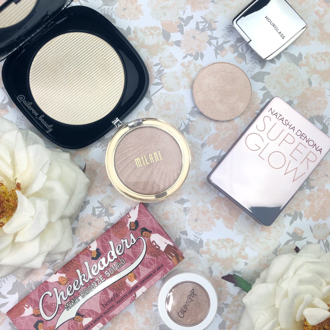
  • MILANI: sometimes yes, sometimes no. I like the soft and sultry but disliked the all matte palette.
  • TARTE: okay… I really dislike tarte shadows. They are probably my least favorite and you aren’t likely to see me featuring their palettes on Instagram.
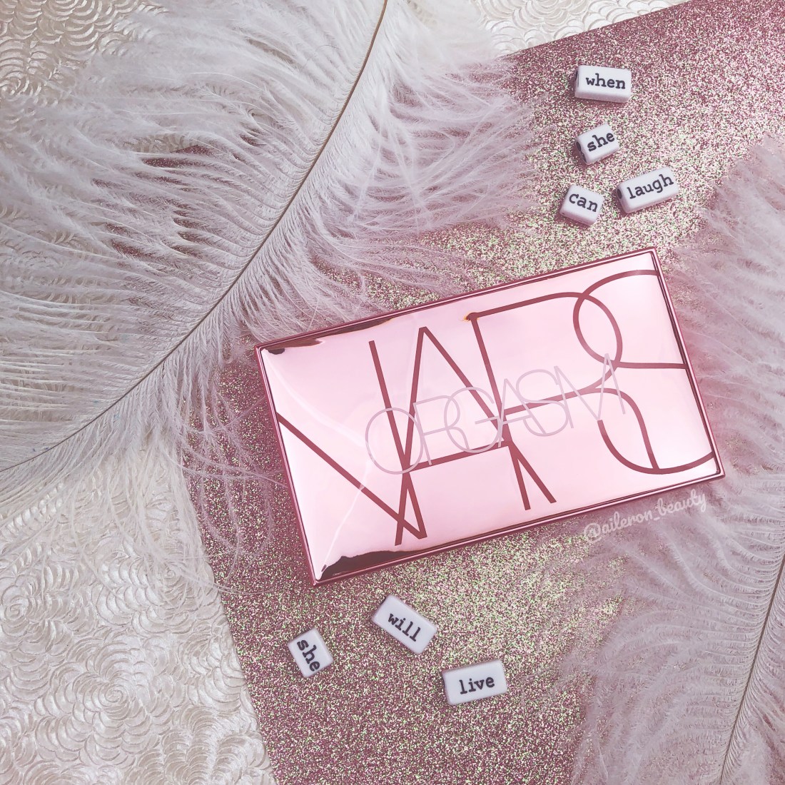
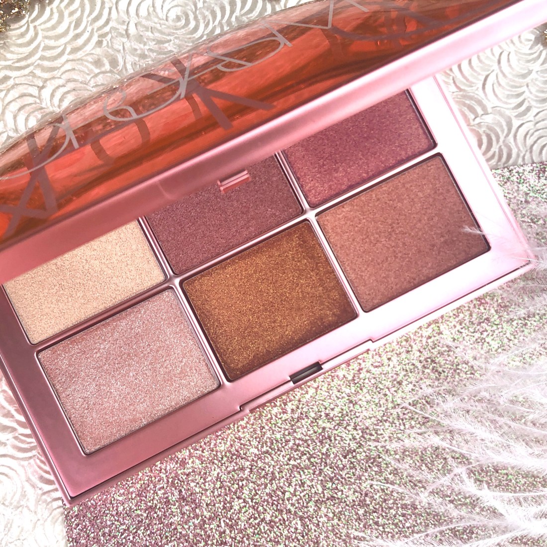
  • NARS: another one that I don’t love. Better than Tarte. But nothing to write home about.
  • NABLA: while I really enjoy my two palettes from the brand, it’s the shimmers and metallics I love so much from them. When I really think about it, their Mattes are kind of a pain in the ass.

Please keep in mind that the above opinions are based on eyeshadow palettes alone. Many of these brands have products that I absolutely adore, and even consider holy grail status… just not so much in the palettes.

Favorite Powder Highlighters

Highlighters. They have been enjoyed almost at an obsessive level by many for a few years now. And even though I don’t think I am as in love with them as other beauty bloggers, I still have amassed quite the collection. And I do have favorites that I think you may be interested in learning about. It can be difficult to find highlighters that are light enough for fair/light complexions, and also… there are a variety of finishes out there. So I am going to break it down for you….

    HOURGLASS AMBIENT INCANDESCENT STROBE LIGHT: I knowing doesn’t look like much based on the swatch next to all the other more intense options, but this is seriously one of my all-time favorites. This one is perfect for those of you who do not like an intense highlight. It does give a slight glow, but will not emphasize skin texture, and it will not look inappropriate in professional settings. Not saying you can’t glow at work, you certainly can. Just I think this is more for those who prefer subtle.
    MILANI AFTERGLOW STROBELIGHT: I think this is an excellent accessible drugstore option. It has more glow factor than the Hourglass option but is still not over the top. It has a slight pink undertone.
    NATASHA DENONA SUPERGLOW FAIR: This one gives a pretty intense shine, maybe my most intense option. The shade leans a little pink but is more beige than the Milani highlighter. It looks very bright on the skin, but will emphasize texture more than the more subtle options.
    MARC JACOBS WORTH THE WAIT: This highlighter is obscenely large. You have no chance of using the whole thing unless you are applying it to your whole body… but you may want to. This one is amazing! It feels so creamy, and looks very intense on the skin without emphasizing texture. Also, it is more of a white shade with a light gold undertone, so because of the undertone, I think it would work for a larger variety of complexions. It’s definitely worth swatching to see if it works for you. I’ve only tried it on myself so far, so I know it is wonderful for fair/light. It’s very pricey, but it’s pretty amazing. Could very well be worth the wait. Check it out.
    BENEFIT COSMETICS COOKIE: This one, so far, is only available in the “Cheekleaders” palettes, both the mini and full size “Bronze Squad” version. I have the mini that also comes with “Gold Dust” blush, and “Hoola” bronzer. This is another intense highlighter. I’d call it a champagne beige shade. It is darker than the others on this list and I definitely think this would work on a variety of skin tones. It looks too dark for me in the swatch, but I guarantee that it works on my cheeks as well. Plus, the blush and bronzer are nice too… so it’s an added bonus. I do highly recommend this!
    COLOURPOP DREAMSCAPE PRESSED POWDER HIGHLIGHTER: If you want affordable as well as intense… look no further. This shade is excellent for fair/light skin tones and I would say that it’s a very light pink beige.
    COLOURPOP FLEXITARIAN SUPER SHOCK HIGHLIGHTER: I wasn’t sure if I should include this since it’s not a traditional powder. But I do find that it’s easy to apply over a set face, so I thought I could include it based on that. I’d say this one matches the Natasha highlighter in shade and intensity pretty closely. Super affordable and the most intense affordable option on this list.

So that pretty much rounds out my faves. I think these are all worth picking up, but I wanted to describe and show them here for you so that you can use this to decide which one (or two) are right for you!

What are your favorite highlighters? Definitely let me know.

Nars Endless Orgasm Palette Review

The Nars Endless Orgasm Palette is a limited edition offering from the brand featuring 6 cream shades that can be used on the eyes, lips, and face. I was initially very excited about this release, as I love cream blushes and bronzers, especially in the spring and summer.

The packaging is absolutely gorgeous, if you care about that. And it feels substantial in your hands.

The shades swatch pretty nicely too (below, finger swatches built up on bare skin), so I was really looking forward to using them.

Unfortunately, I don’t have very many positive things to say. First off, it is incredibly difficult to apply. I tried a beauty blender, brush, and even my fingers. I found that they applied very uneven and patchy for the most part. The deepest shades being the worst offenders. For the highlight shades I was actually able to get a nice application using my fingers. But the blush and bronzer shades… they were lifting up my foundation, and looked sheer in some spots and heavily pigmented in others. They also felt heavy and greasy on my skin. Almost like lipstick… but like a child’s lipstick… not great quality is what I’m saying… you know what I mean.

After about an hour or so of wear time, I noticed that they were filling my pores and sitting strangely on my skin overall. Like they were separating. It looked very textured and cracked. Like the surface of an orange but with deep ravines throughout. The next day I tried again, but this time I tried setting with powder. Well that was a mistake. It looked even worse.

So then, as a last resort. I tried it on bare skin. This was the best option. But it was still very difficult to get an even application. So I could say that MAYBE, if you are looking for something to use on bare skin for a quick summer look… maybe it would work for you. But if you intend on using it with any other makeup products, don’t expect it to play nicely with others.

Overall, for me, it is not worth the hassle and the inconvenience of not working with other products. It was a great idea, and had it been a more forgiving formula, I would have been totally on board.

Have you tried it? What did you think?

LimeCrime Venus XL II

LimeCrime palettes hadn’t really been on my radar for a while. No real reason other than the fact that my favorite brands to purchase has changed to Viseart, Natasha Denona, and ColourPop over the past couple years. And while I am aware that many in the beauty community found the first look of this new LimeCrime offering to be anticlimactic at best… I fell in love with the color story. The same thing that caused many to complain, is exactly why I knew I must have it. You see, I recognized immediately that it was a fairly unique palette. The muted shades told a cohesive story. A wood nymph, or a fairy, or whatever you wish to call it. But one with a grunge edge. Many palettes do have a color story or a theme… but not many strike me immediately as such a defined vibe. That, to me, is the beauty and the genius of this palette. And unfortunately, seeing the swatches alone does not tend to translate this thought. But here are the swatches anyway, because I know you want to see.

See what I mean? If you are saying to yourself… “eh… doesn’t look that special.” that’s exactly what I figured would happen. But when you get these shades on your eyes, and realize that these muted colors are flattering without being too bold, or garish… that is when you will appreciate the palette. Well, you may appreciate it before then. But while I would categorize this as a “wearable” palette… I would not say this one is boring… and if you know me from Instagram, then you know that I adore “boring” palettes. This is not one of them. I would also say this is a great choice for those of you who tend to refrain from using color. But at the same time, I know quite a few “color lovers” who can’t get enough of this palette either. Just take a look at a few of the looks I’ve created with this palette.

This one is soft and gentle, yet still has color without being over the top.

This one has a dramatic flair but with a level of sophistication that you could wear this anywhere and be proud.

This is quite possibly my all time favorite eyeshadow look that I’ve ever done. This look was done in collaboration with my friend Monica on Instagram, and she chose the colors for me to use. But I absolutely fell in love with this look and I think I could wear it everyday.

Let’s talk about the quality of the shadows… overall, I would say they are very good. But there are a few issues. First off, and most annoyingly, the shade “Sage”, which also happens to be one of the most unique matte shades I’ve ever come across, is not without issues. I find that it does not like to be blended, and if you do blend it, do so lightly. It seems to come across better when packed on. Not a huge deal, but that may throw a wrench in your plans. I’ve noticed that with blending, it can tend to take on a muddied and patchy look.

Also, some of the shades do feel as though they will develop hard pan, so even when I was doing swatches, I opted to scrape some of those shades out rather than rubbing my finger in the pan. The one I think most prone to this is the shade, “Obscure”. And this is another really unique shade. In person, it almost appears to glow.

I would say though, that despite its issues, I find this to be a palette worth owning. The problems do not interfere with my overall adoration of the palette.

I do hope that you found this information helpful in deciding whether or not this palette is for you.